
Staropol 2.0 — Rebranding a Classic Polish Inn into a Modern Dining Concept
Context & Challenge
The client — previously known as Zajazd Staropolski — was a long-established traditional Polish restaurant with a very classic, almost nostalgic brand image. With a full interior renovation underway and the addition of a contemporary cocktail bar, the owners aimed to reposition the venue for a new generation of guests. The challenge was to preserve authenticity and local roots — but translate them into a fresh, relevant and urban experience.
Strategy & Direction
The core insight was to evolve, not erase. Instead of breaking completely from tradition, we reframed Polish heritage through a modern lens. The new name — Saropol 2.0 — became a symbolic bridge between past and future: recognisable, but forward-looking.
Design Execution
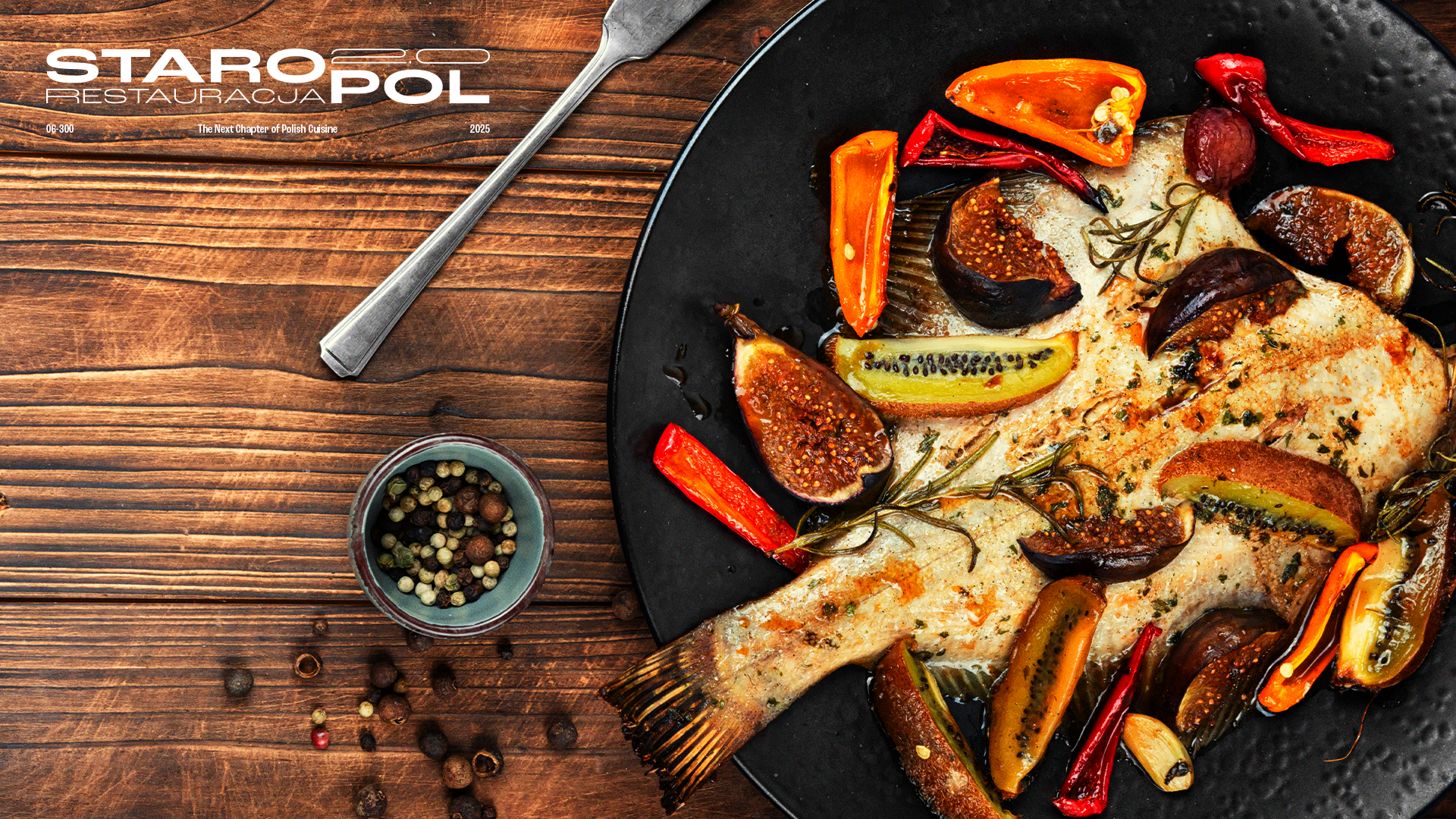
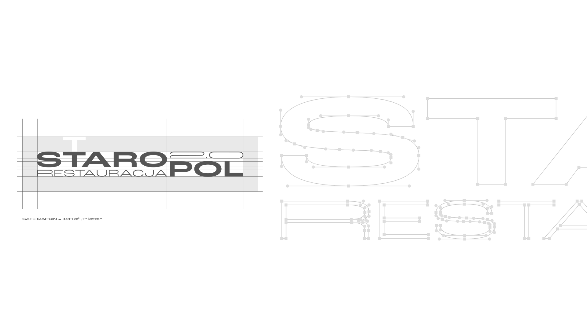
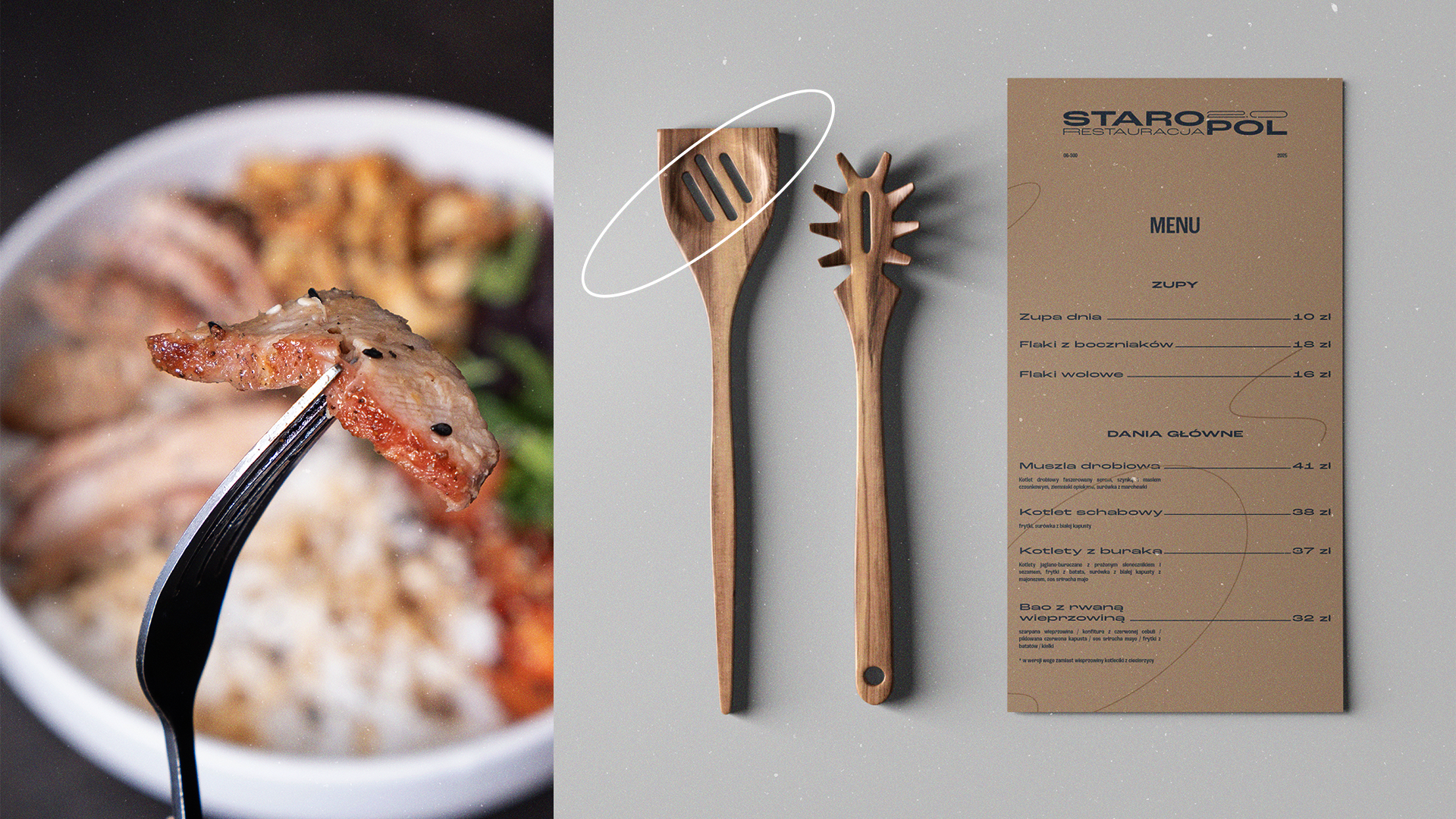
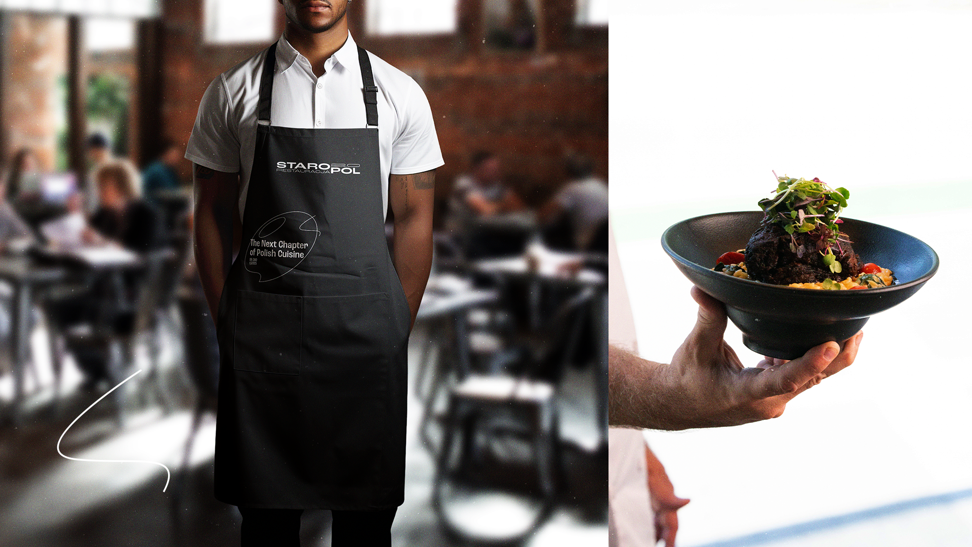
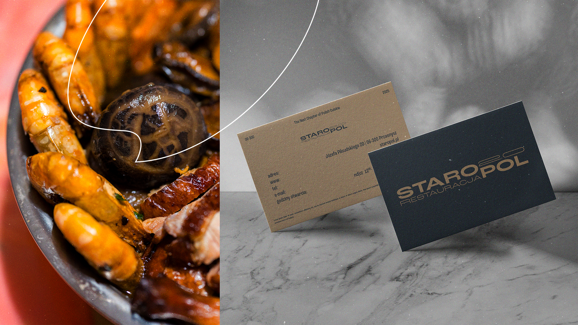
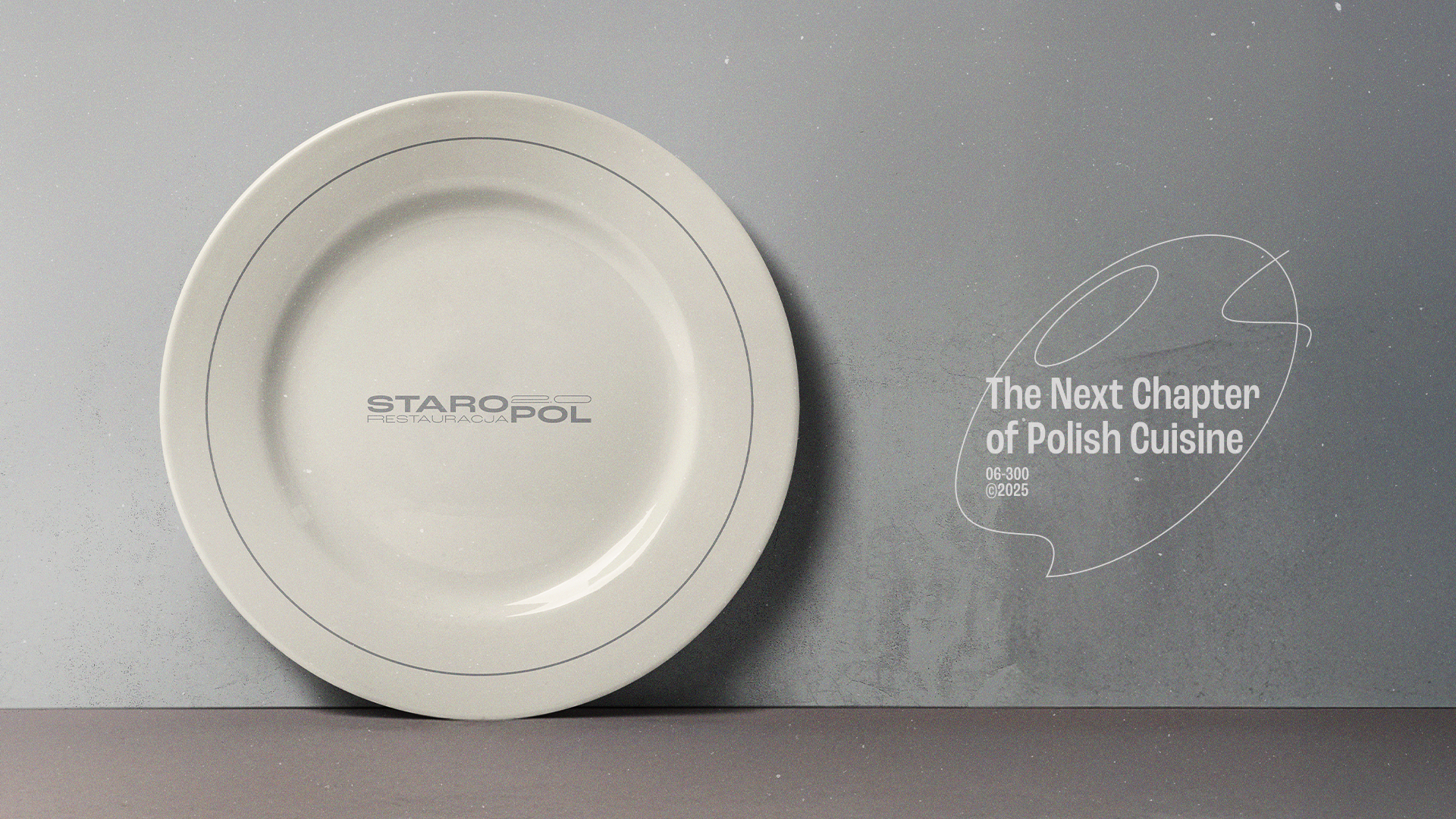
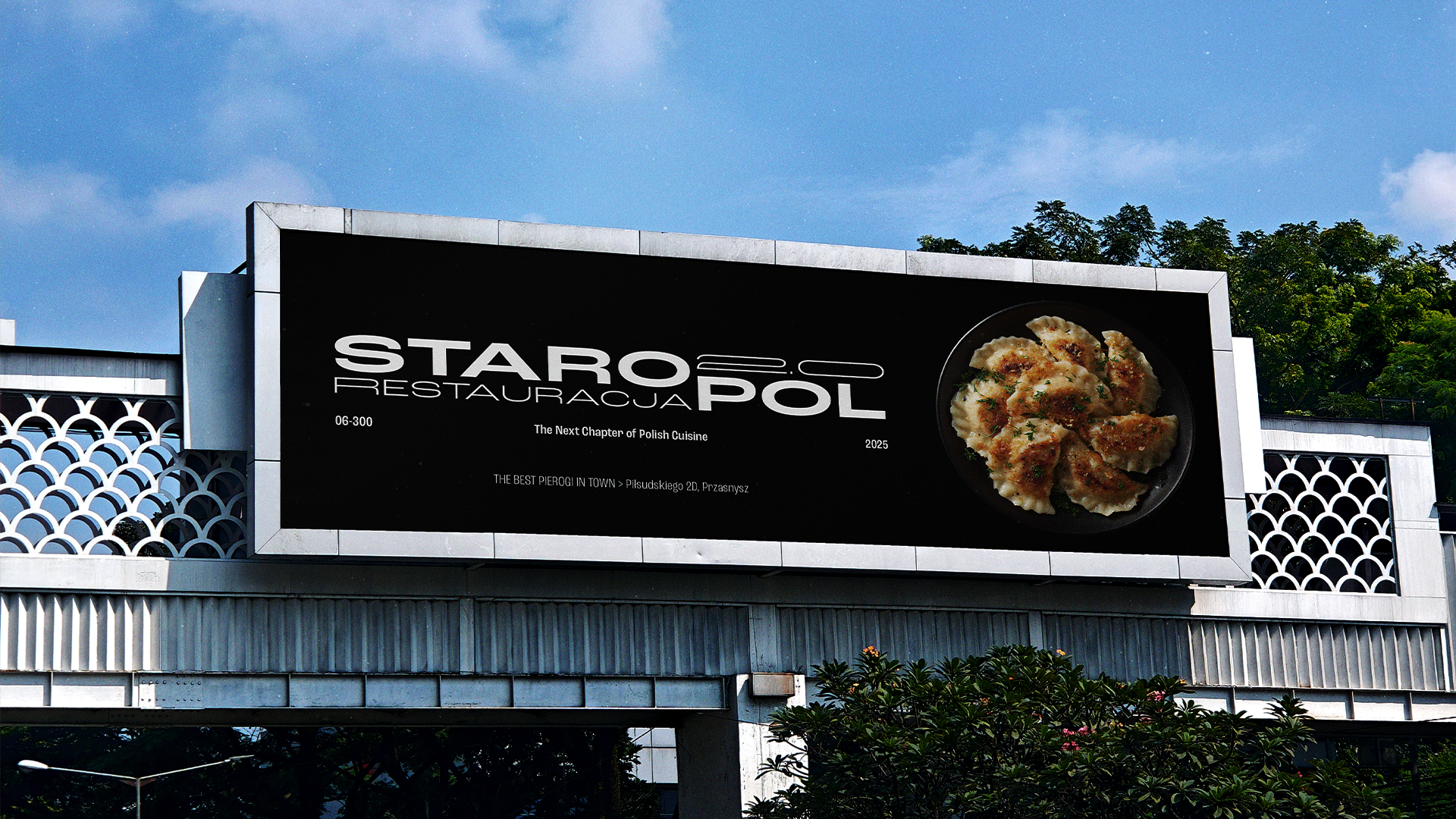
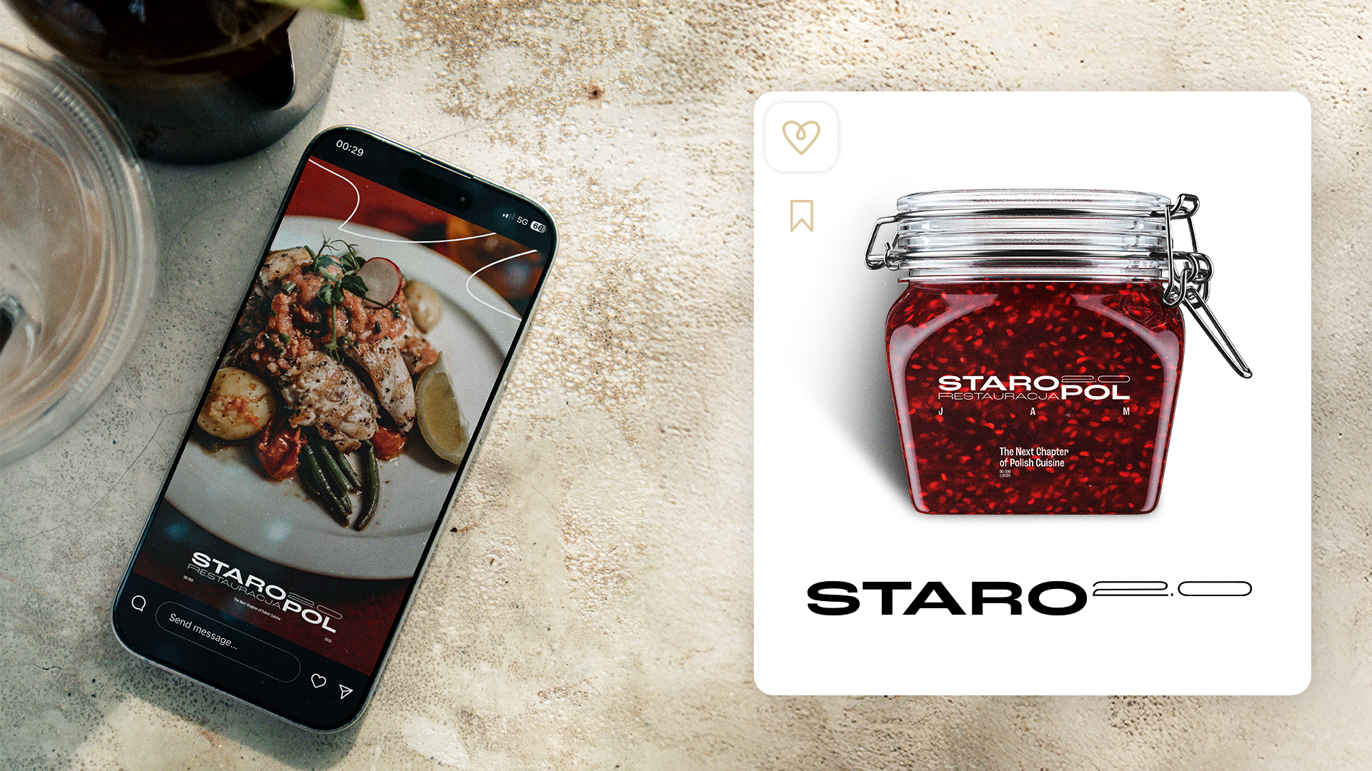
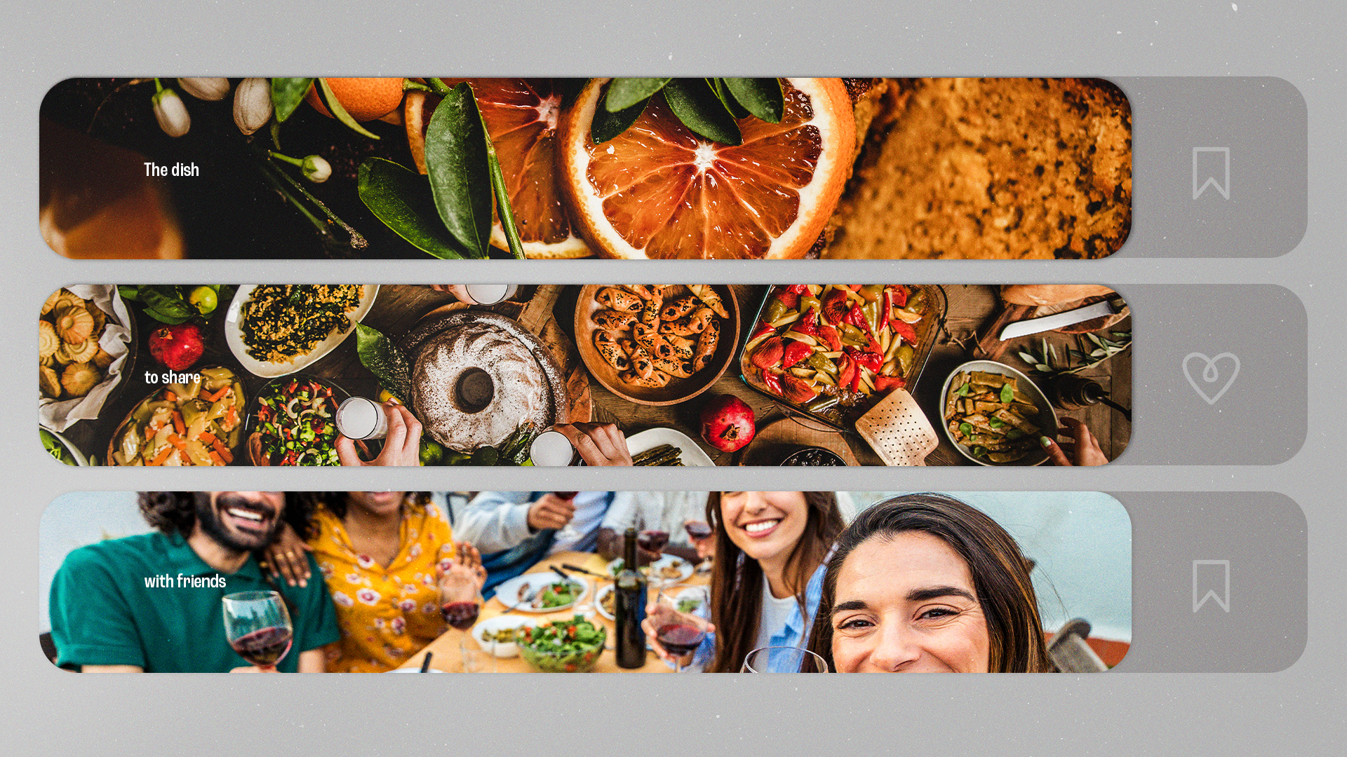
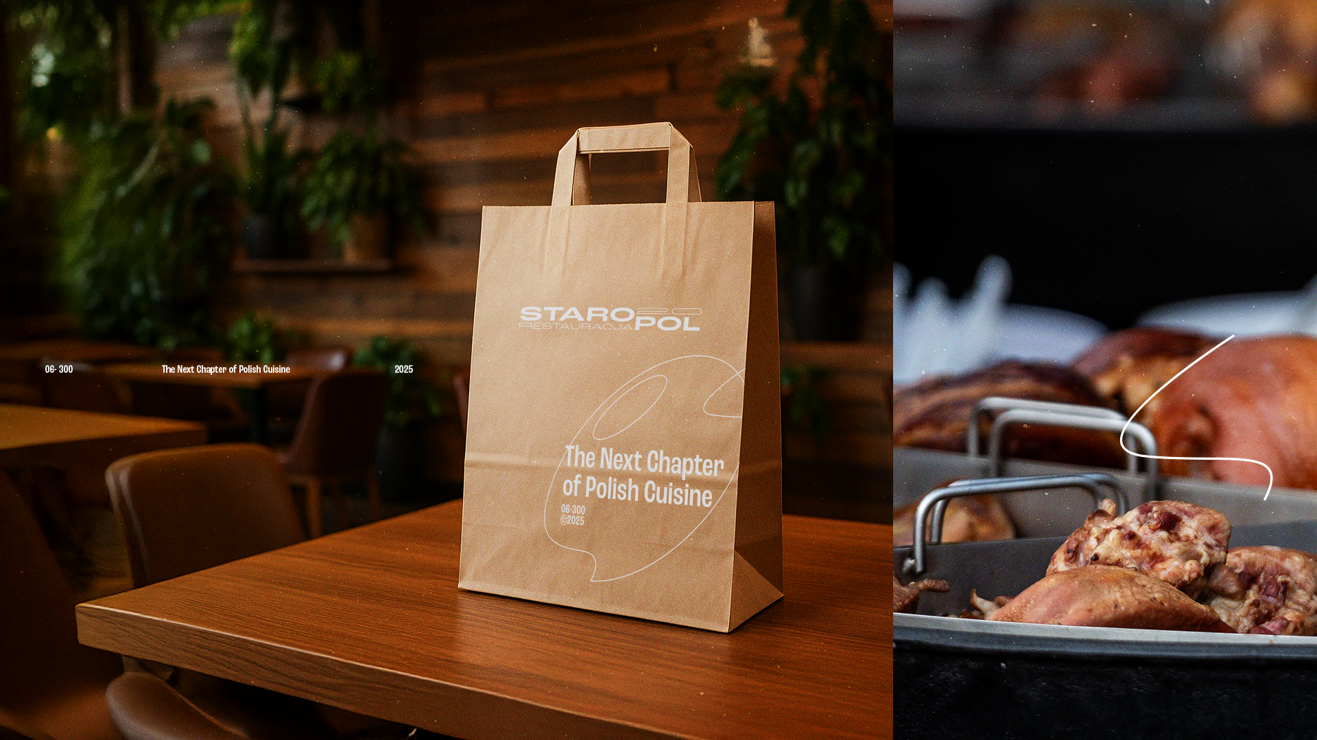
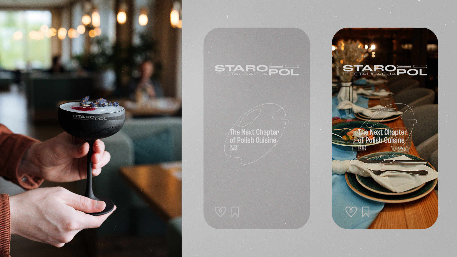
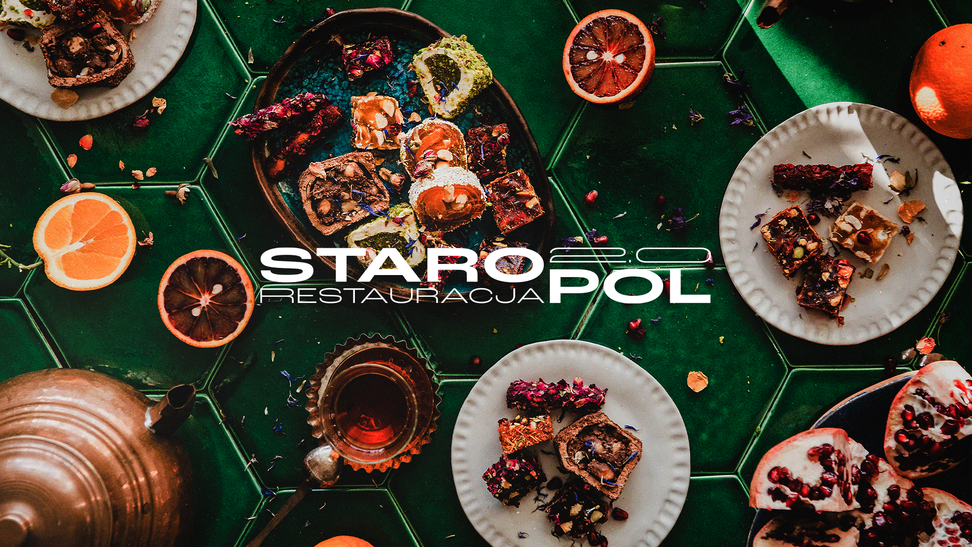
I refreshed the logotype and developed a complete visual system — including typography, color palette, graphic language and communication tone. The aesthetics merge heritage elegance with modern minimalism — clean layout structure, high-contrast typography and subtle textures referencing Polish craftsmanship. The identity seamlessly adapts across restaurant touchpoints and the newly introduced cocktail bar experience.
I refreshed the logotype and developed a complete visual system — including typography, color palette, graphic language and communication tone. The aesthetics merge heritage elegance with modern minimalism — clean layout structure, high-contrast typography and subtle textures referencing Polish craftsmanship. The identity seamlessly adapts across restaurant touchpoints and the newly introduced cocktail bar experience.
Outcome
Saropol 2.0 now communicates as a refined yet approachable destination for modern Polish dining — classic flavors served in a contemporary urban setting. The rebrand elevated its perception, attracting a younger audience without alienating long-time guests.
Saropol 2.0 now communicates as a refined yet approachable destination for modern Polish dining — classic flavors served in a contemporary urban setting. The rebrand elevated its perception, attracting a younger audience without alienating long-time guests.

THANK'S FOR YOUR ATTENTION!
koxuoner / typophobia® studio 2025