TYPOPHOBIA STUDIO Self Branding
Project/Creative Direction: Konrad "Koxu" Łukasiak / TYPOPHOBIA
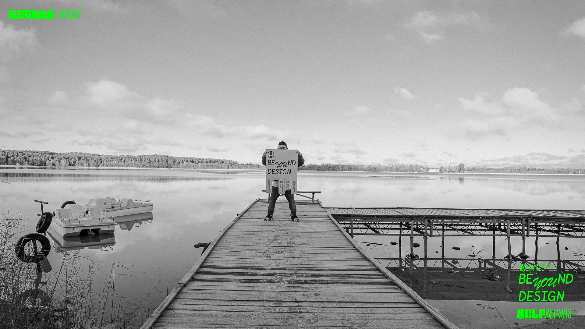
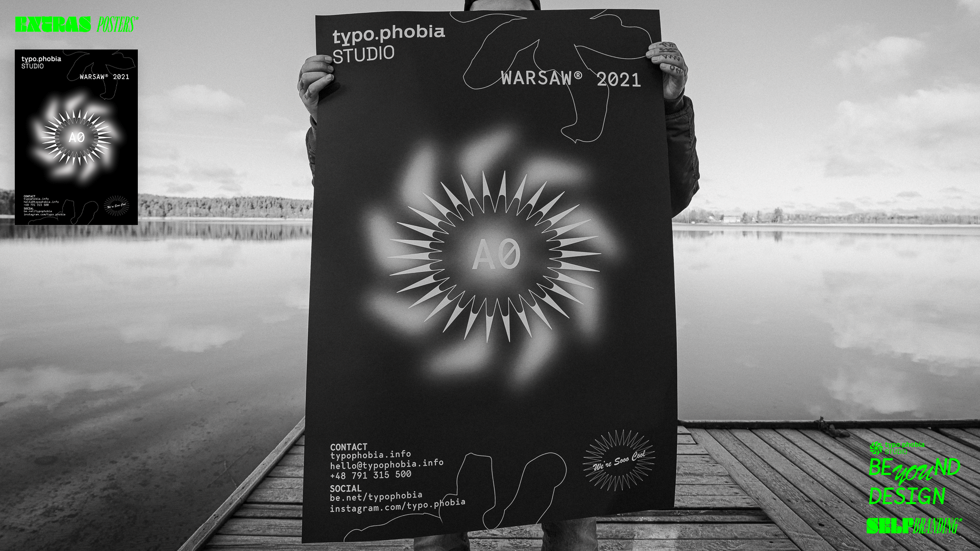
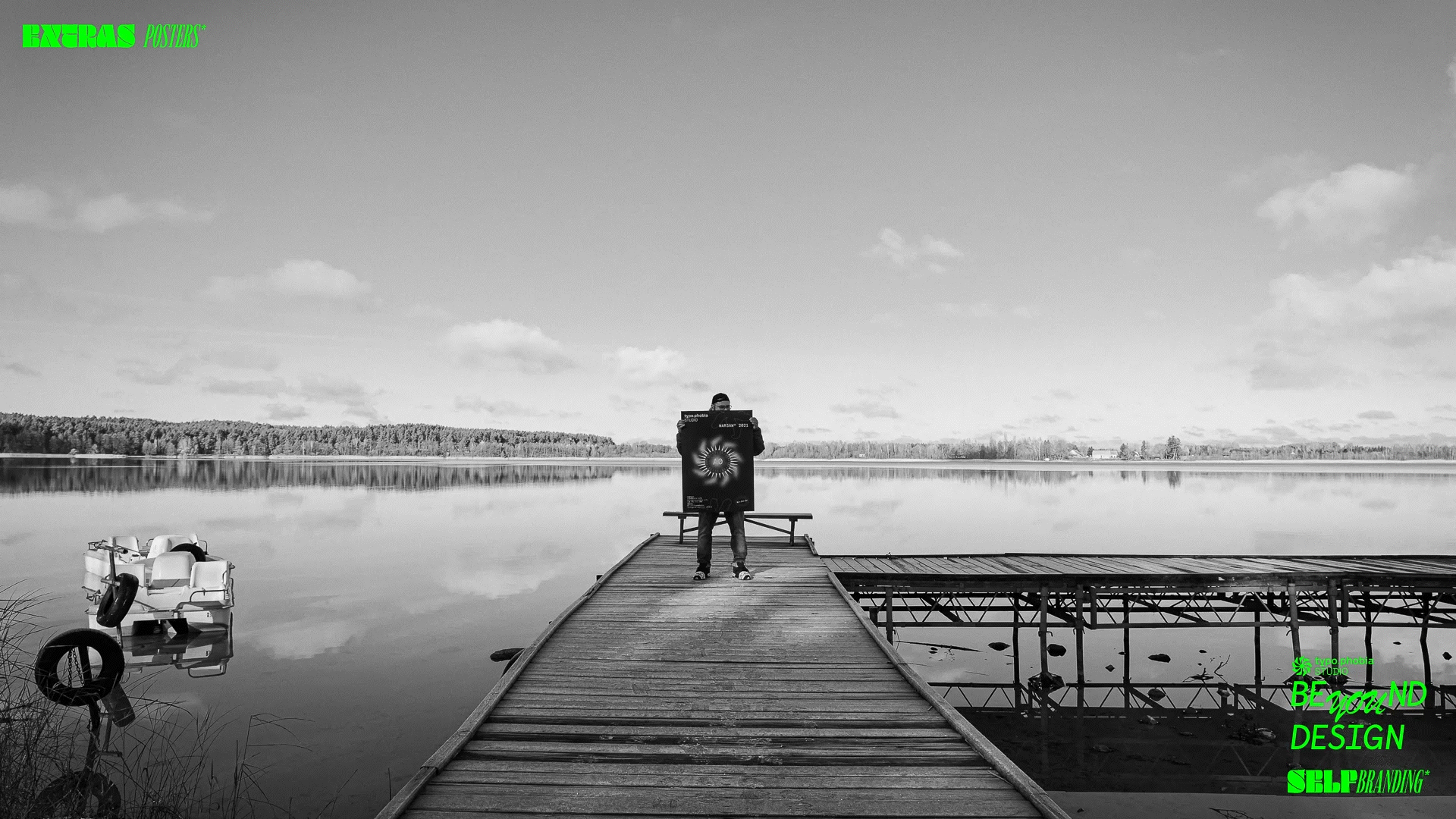
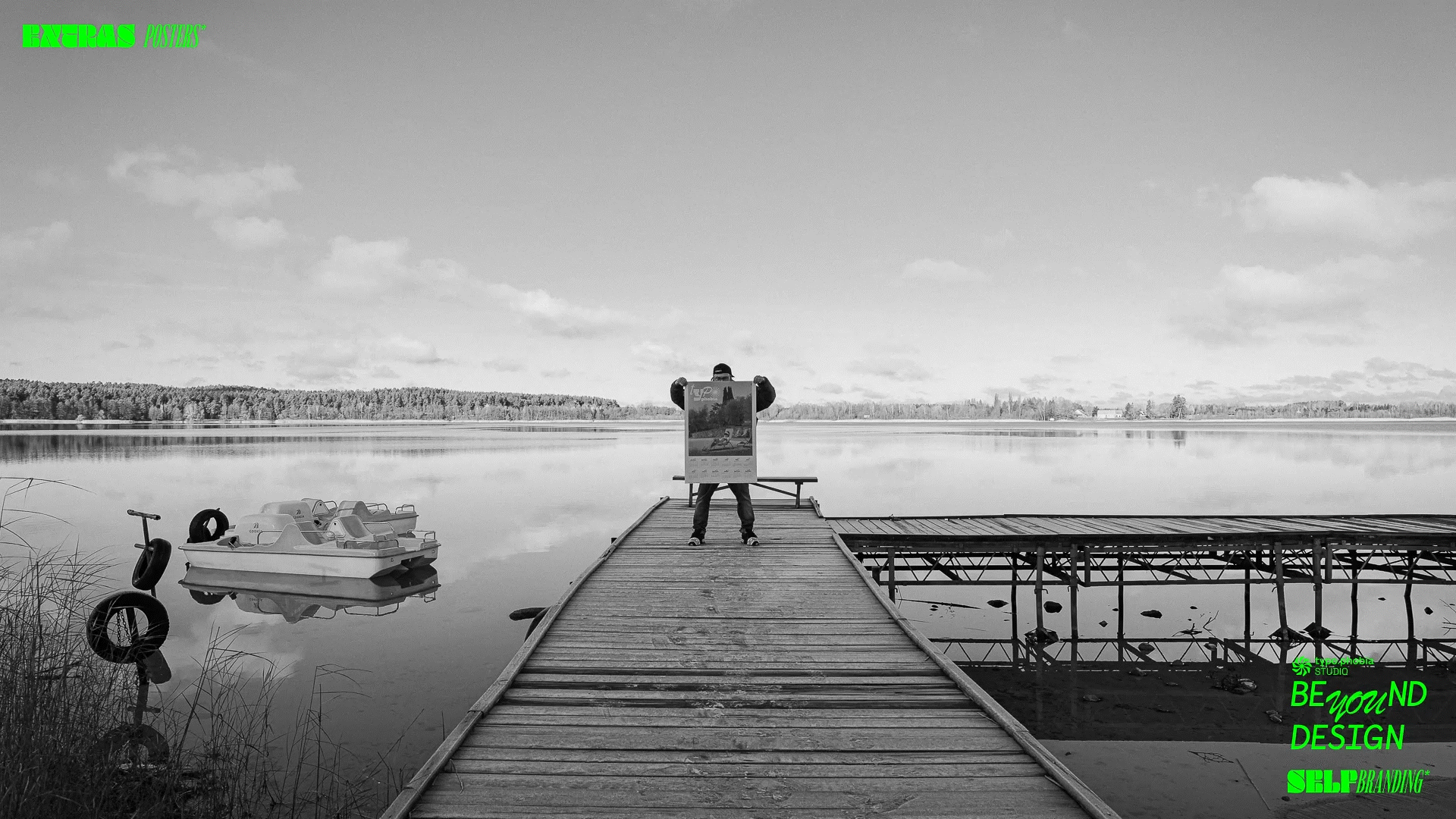
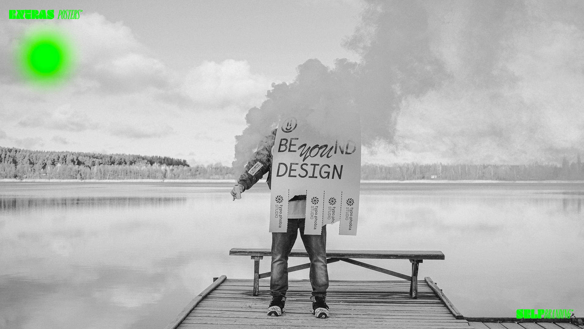
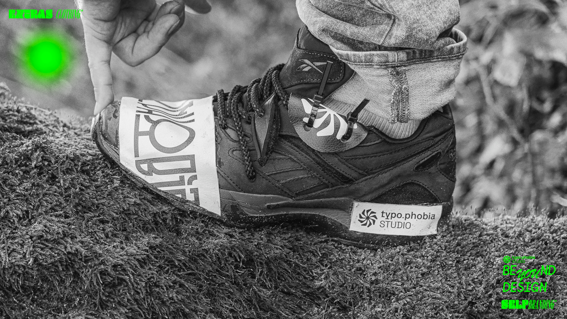
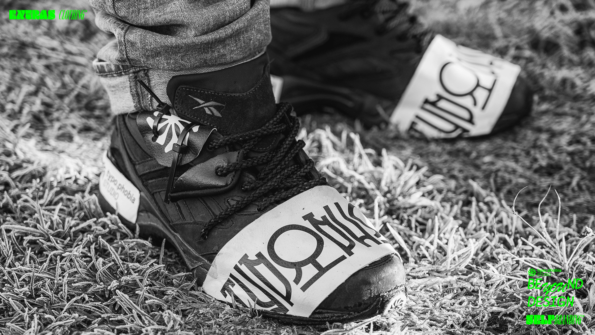
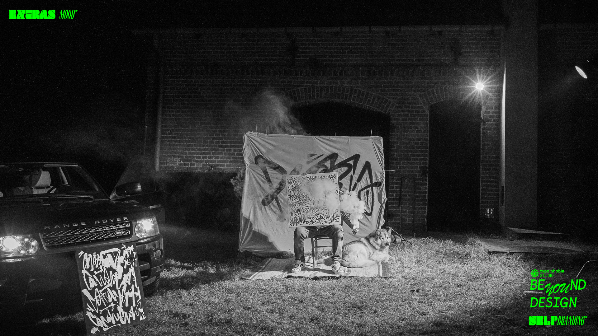
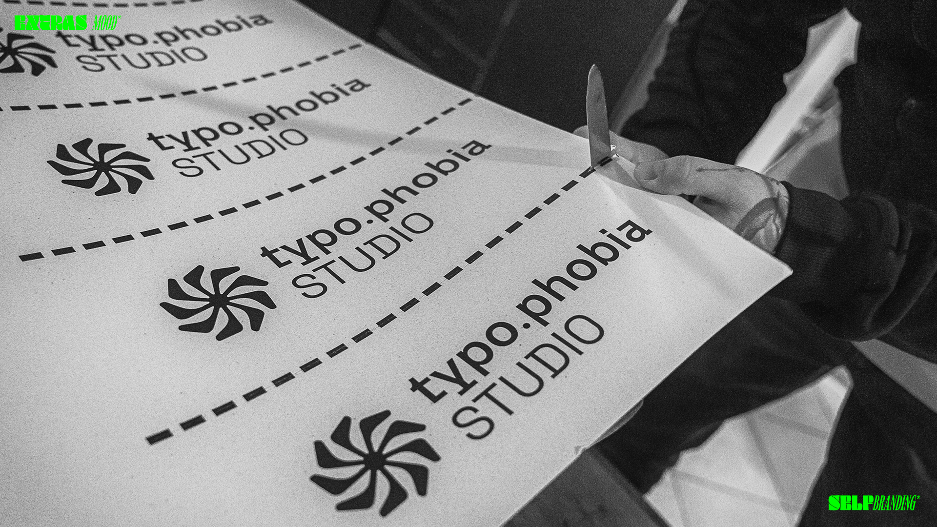
Photos: Krzysztof Sawicki / ZAJARANI.PL
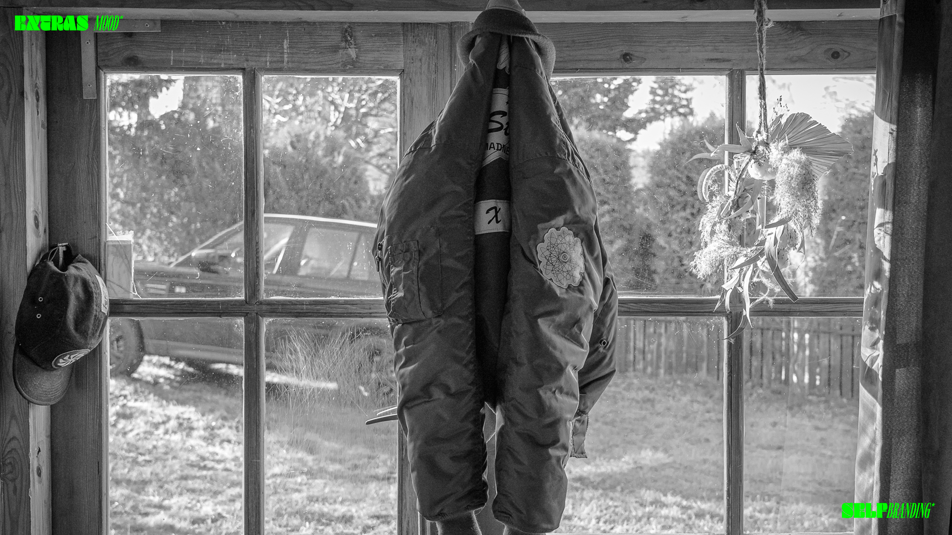
Photos: Krzysztof Sawicki / ZAJARANI.PL
MAZURY 2021®
53°32′22″N 20°47′08″E
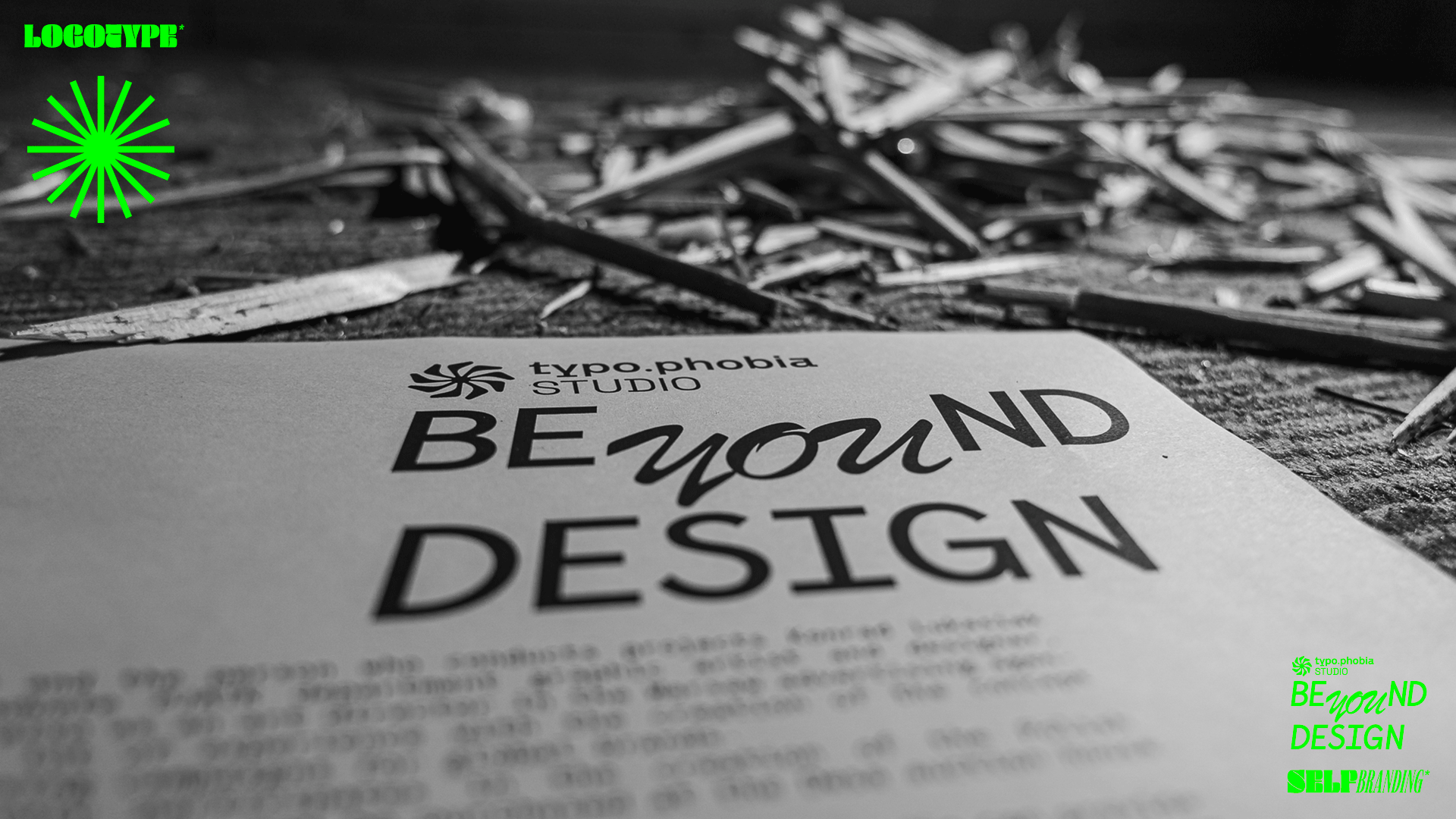
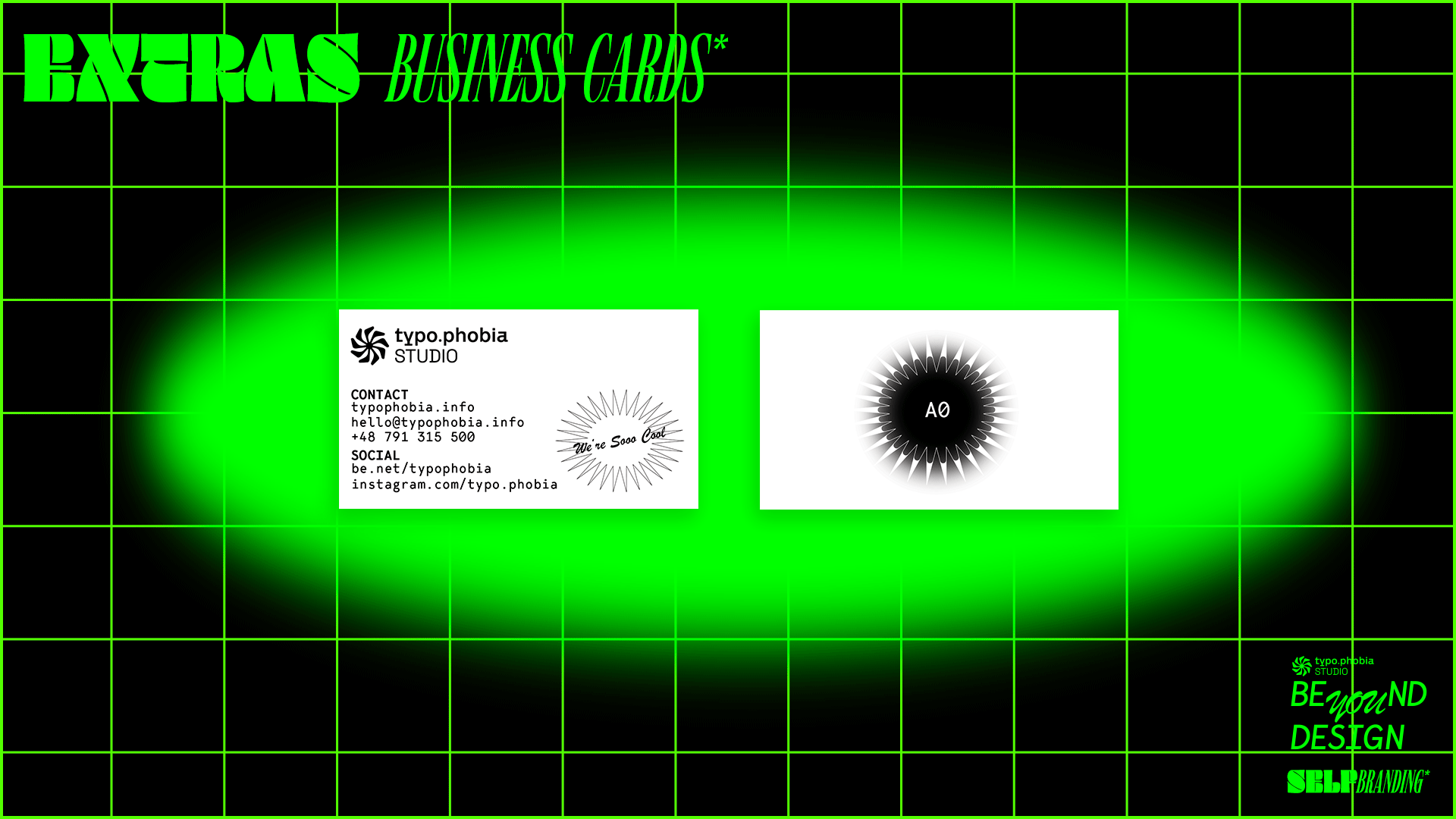
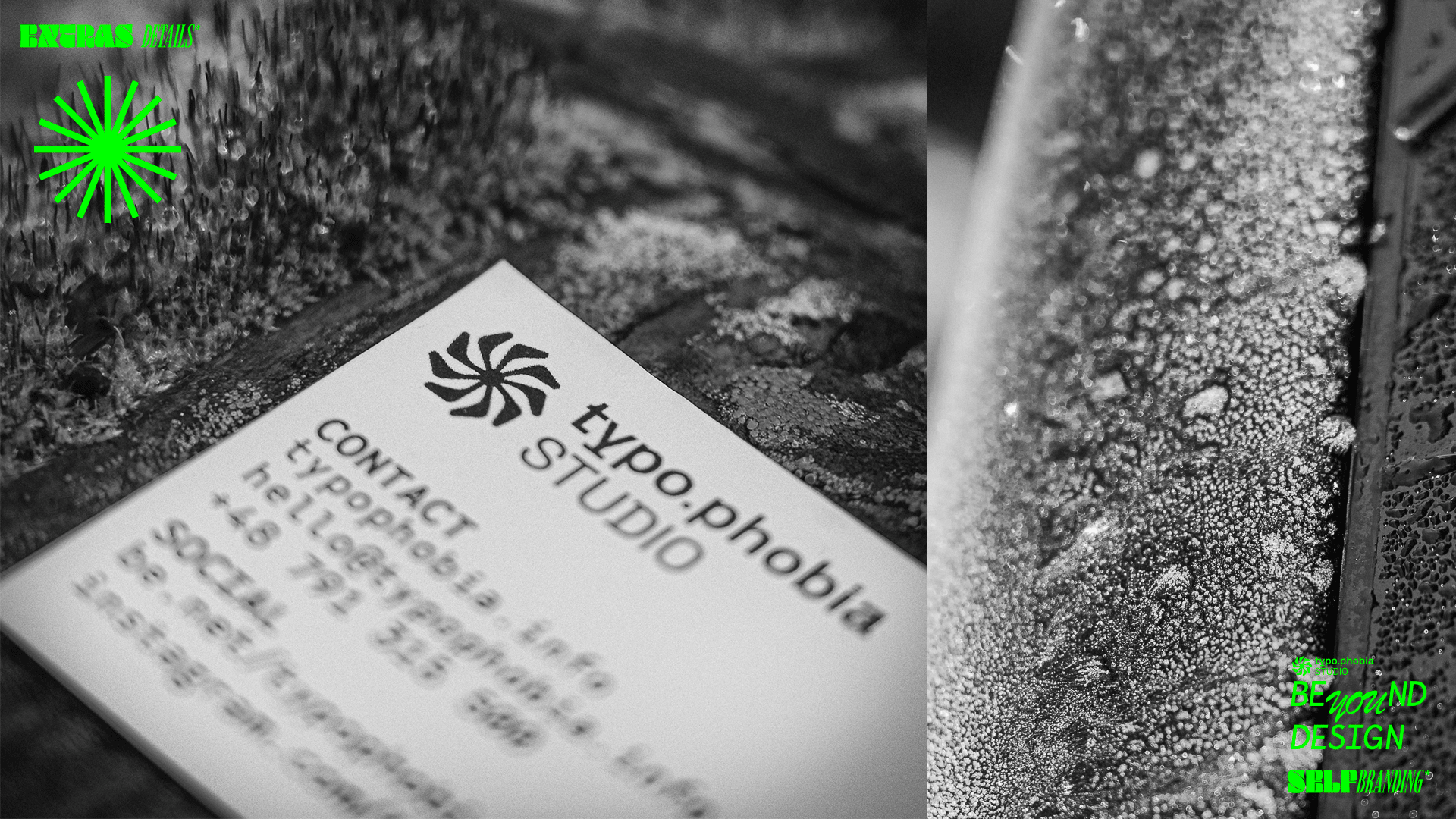
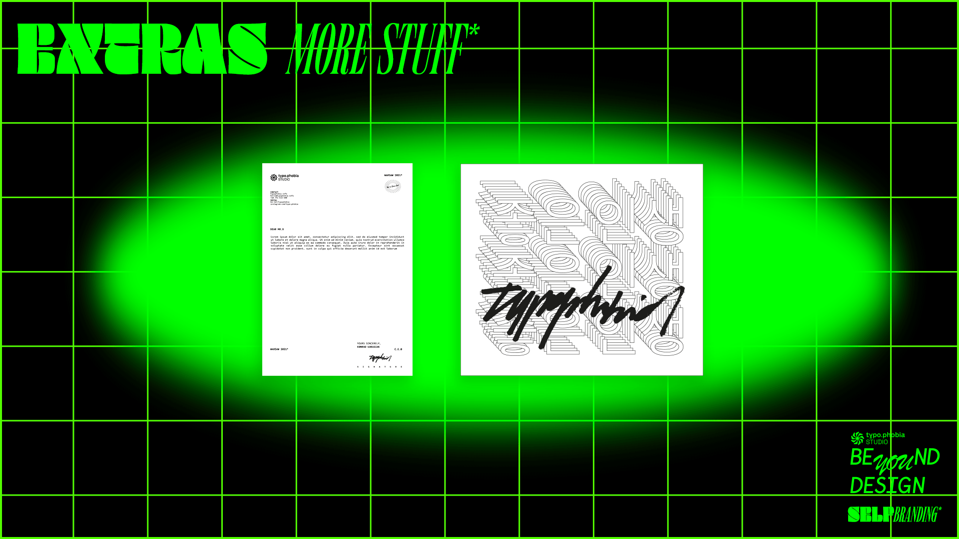
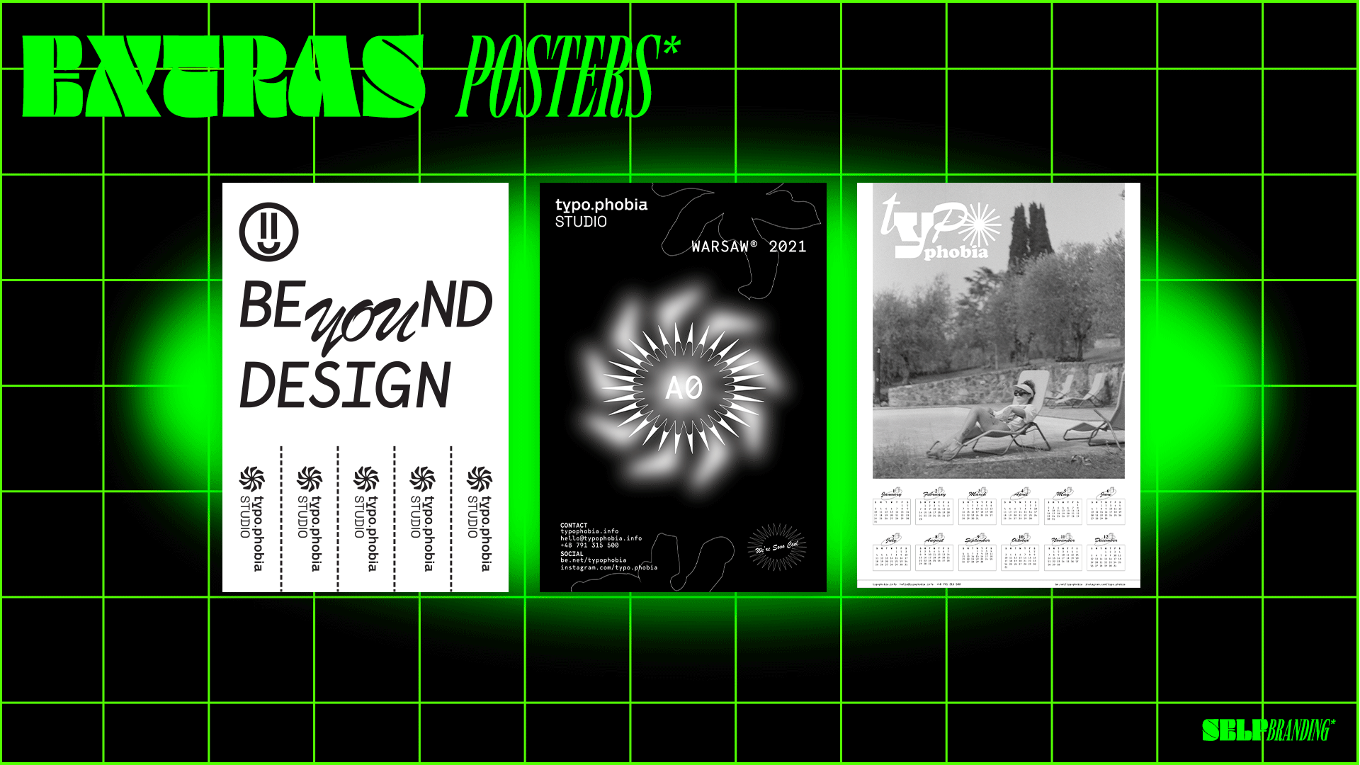
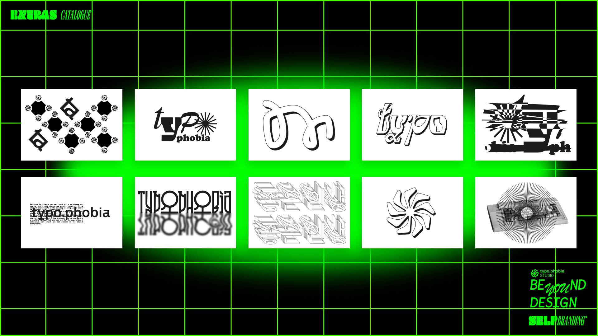
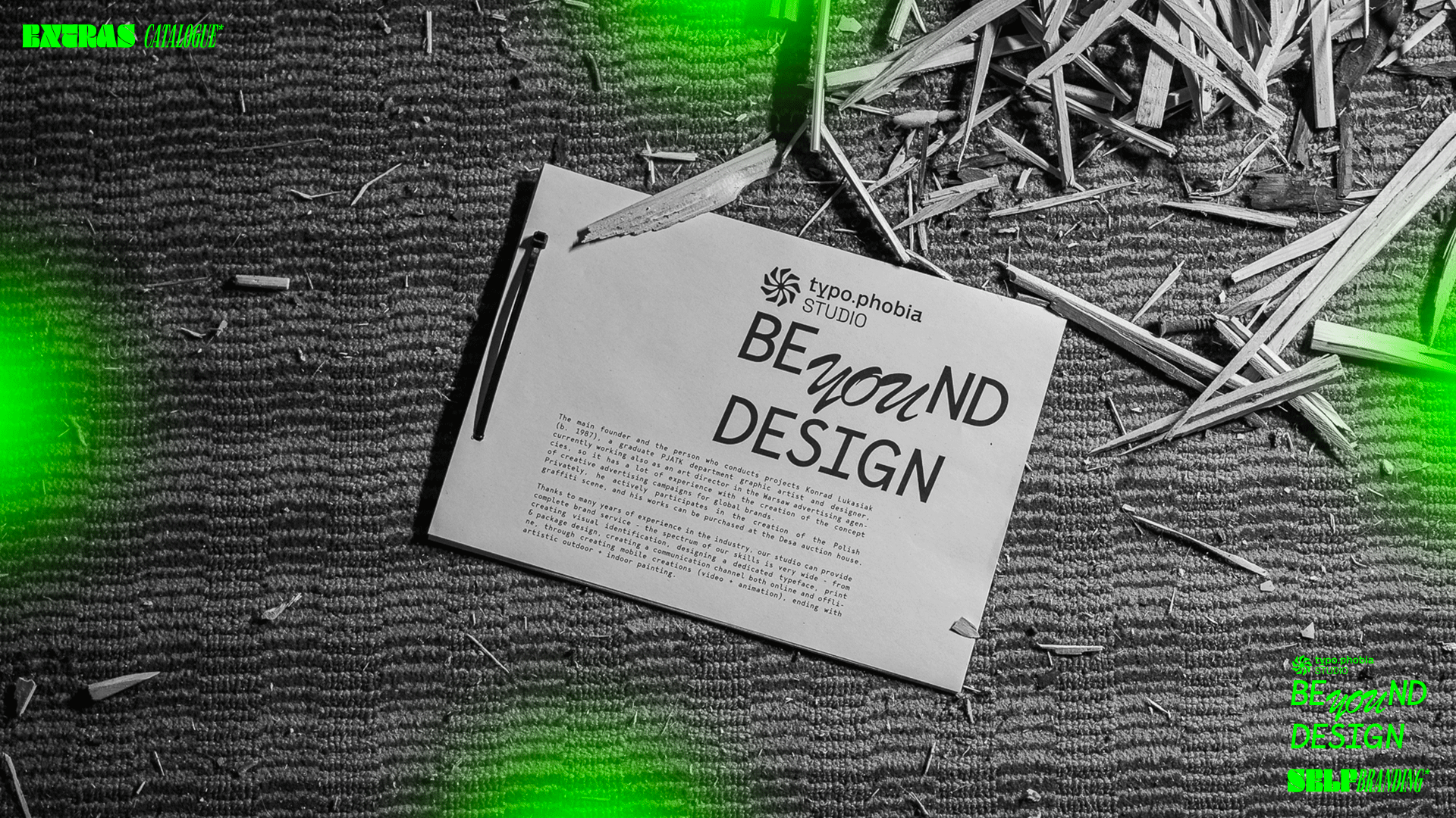
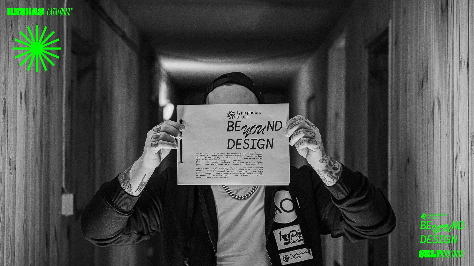
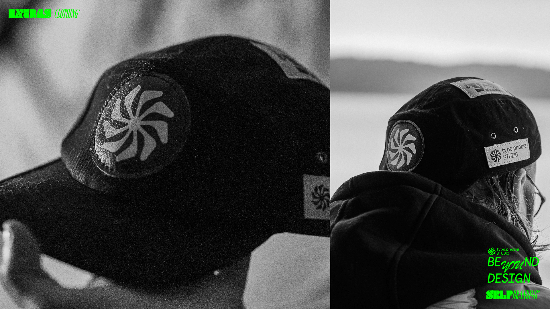
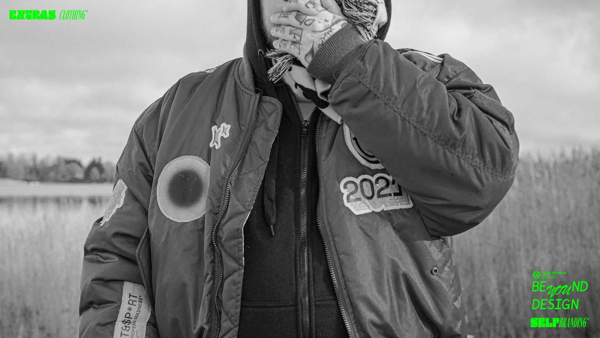
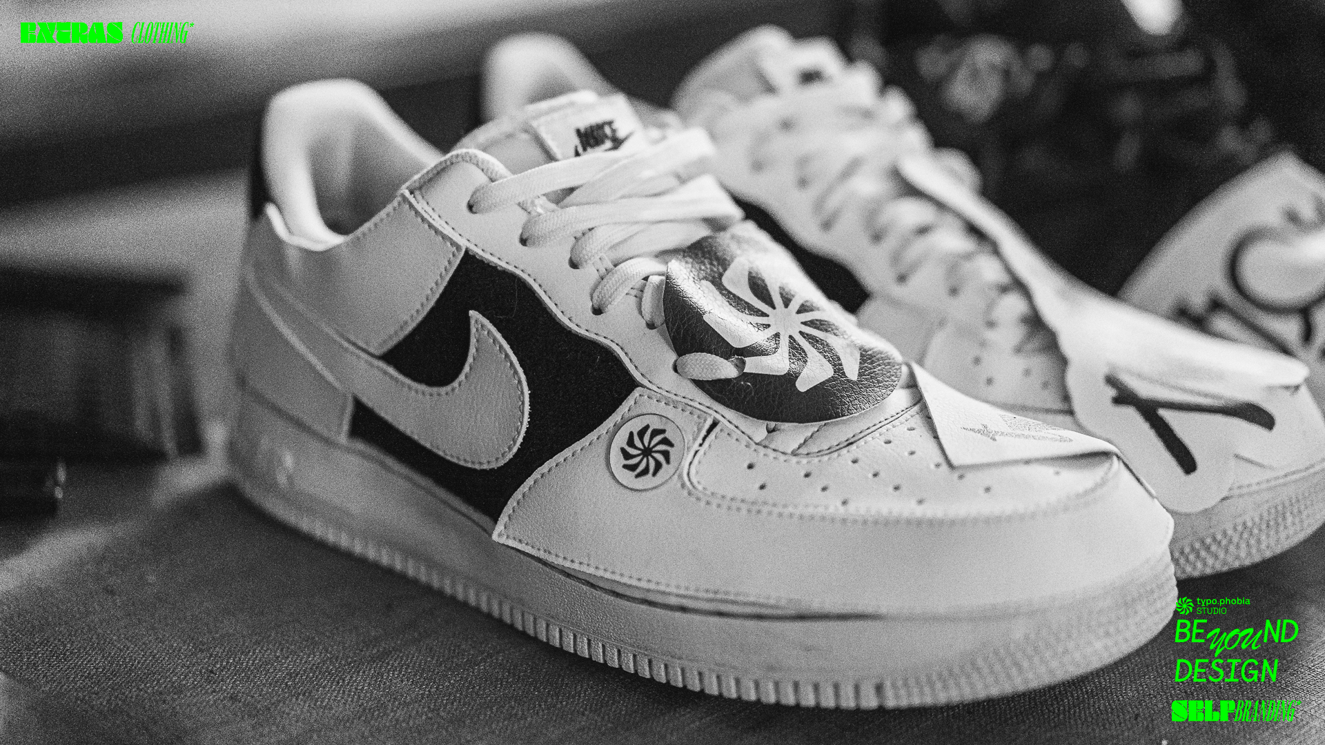
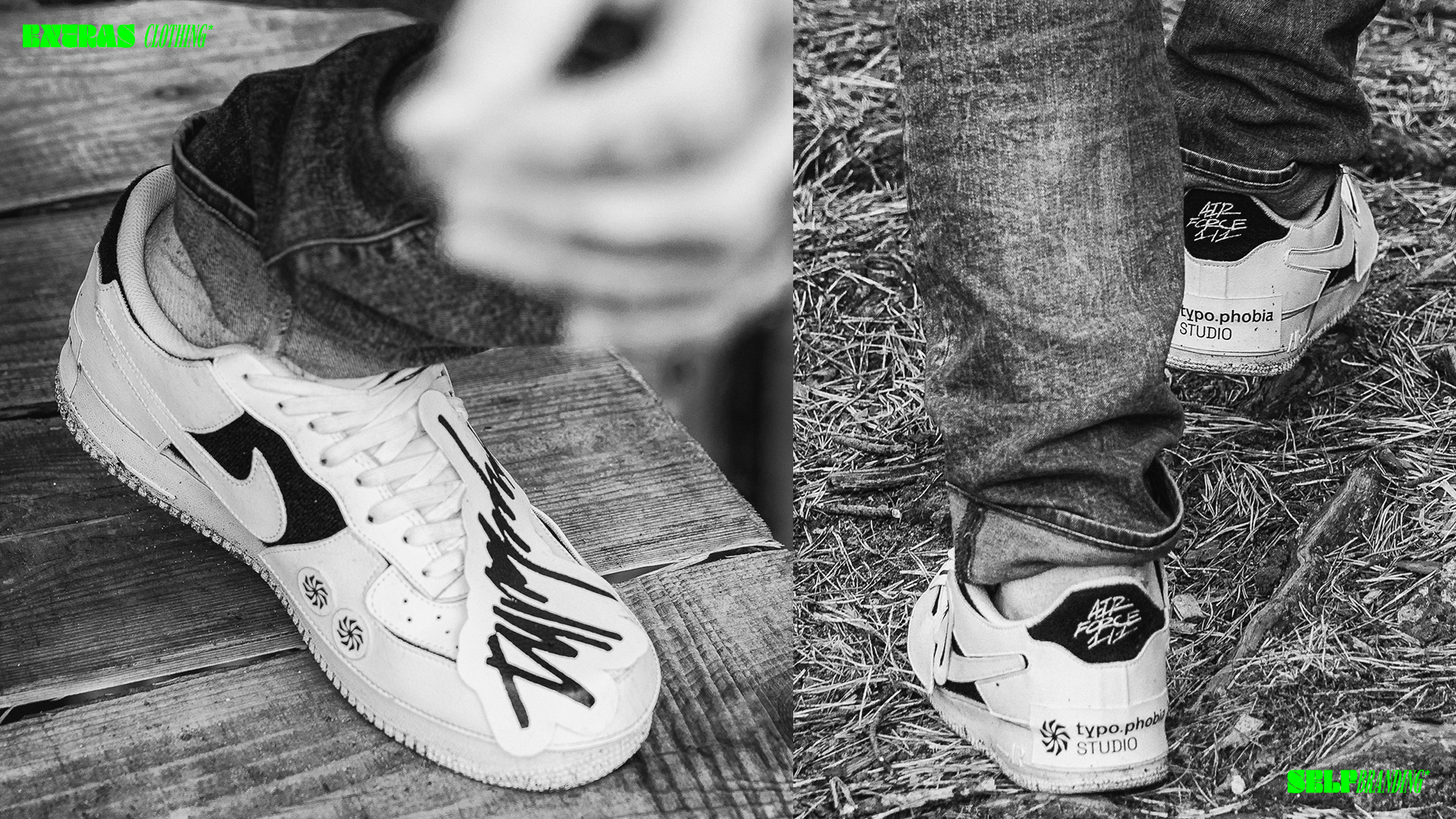
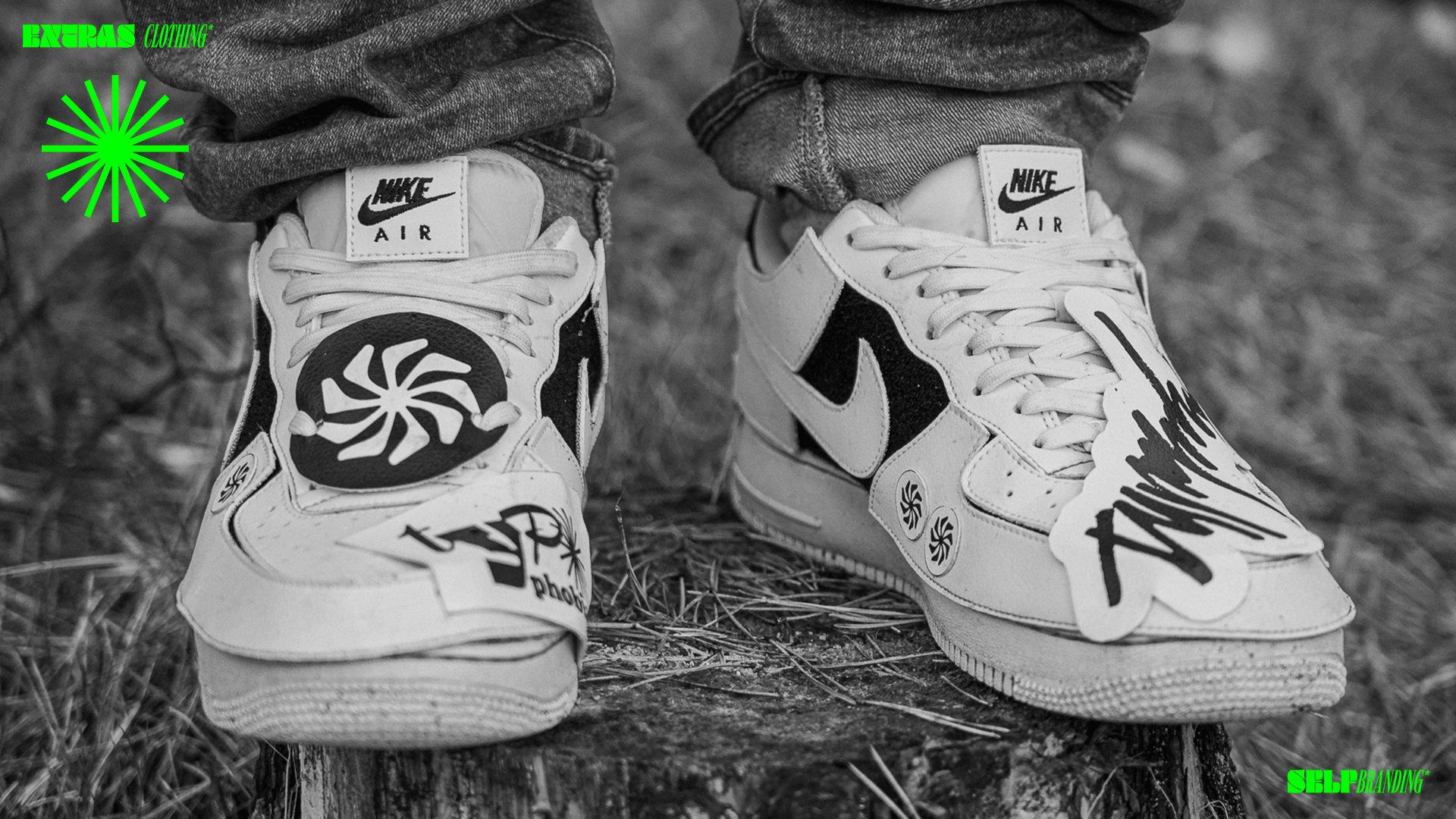
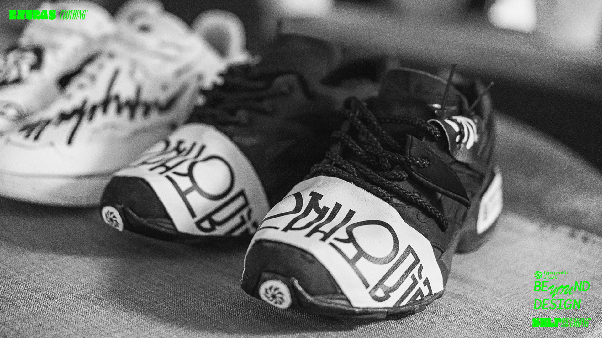
The project was presented in such a way as to show the cross-section of the studio's design and digital competences and possibilities, both in the form of a print, visual identification and in the broadly understood field of the fashion industry.
All visual aspects of the presentation were created solely for the purposes of the above concept.
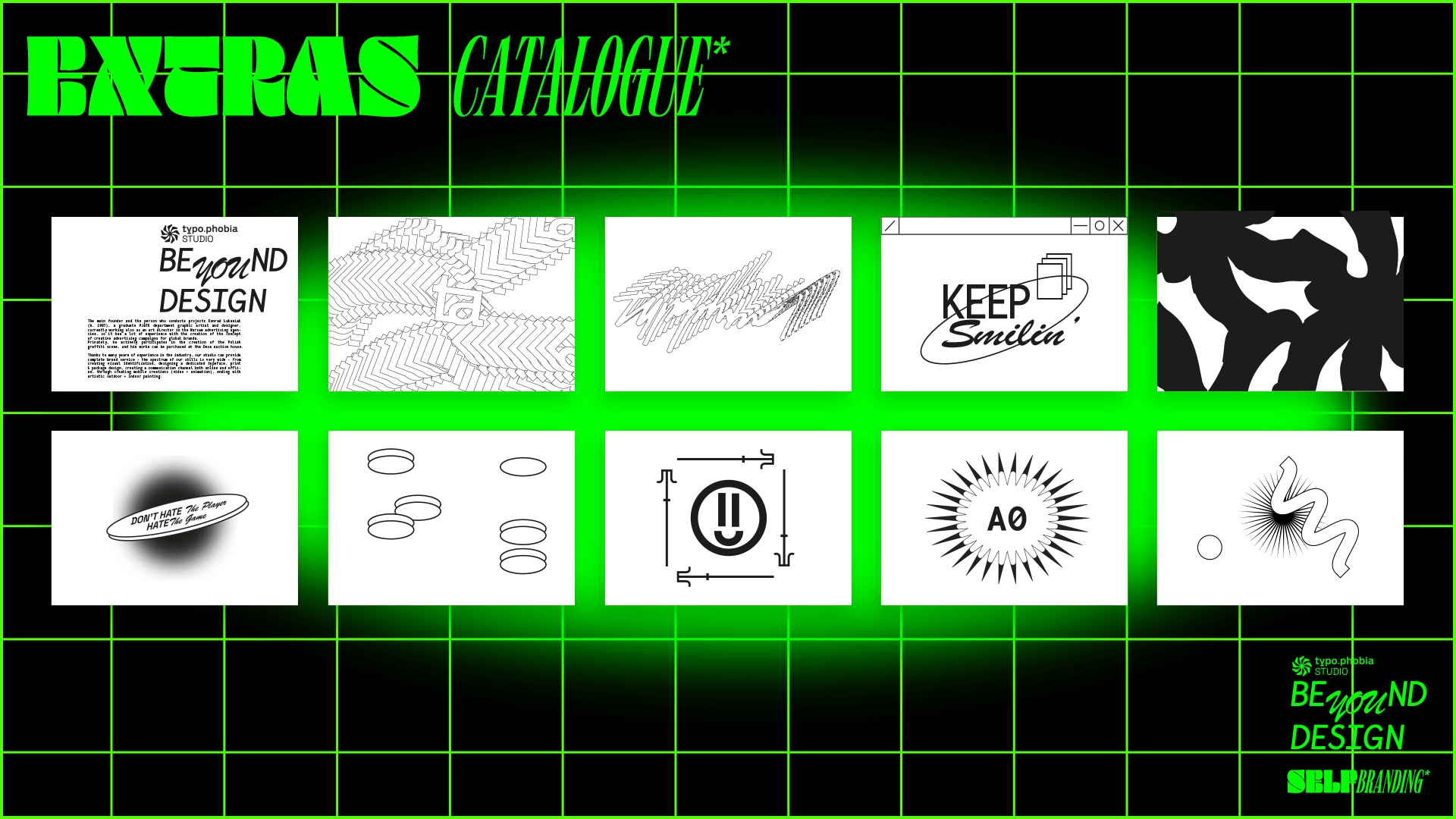
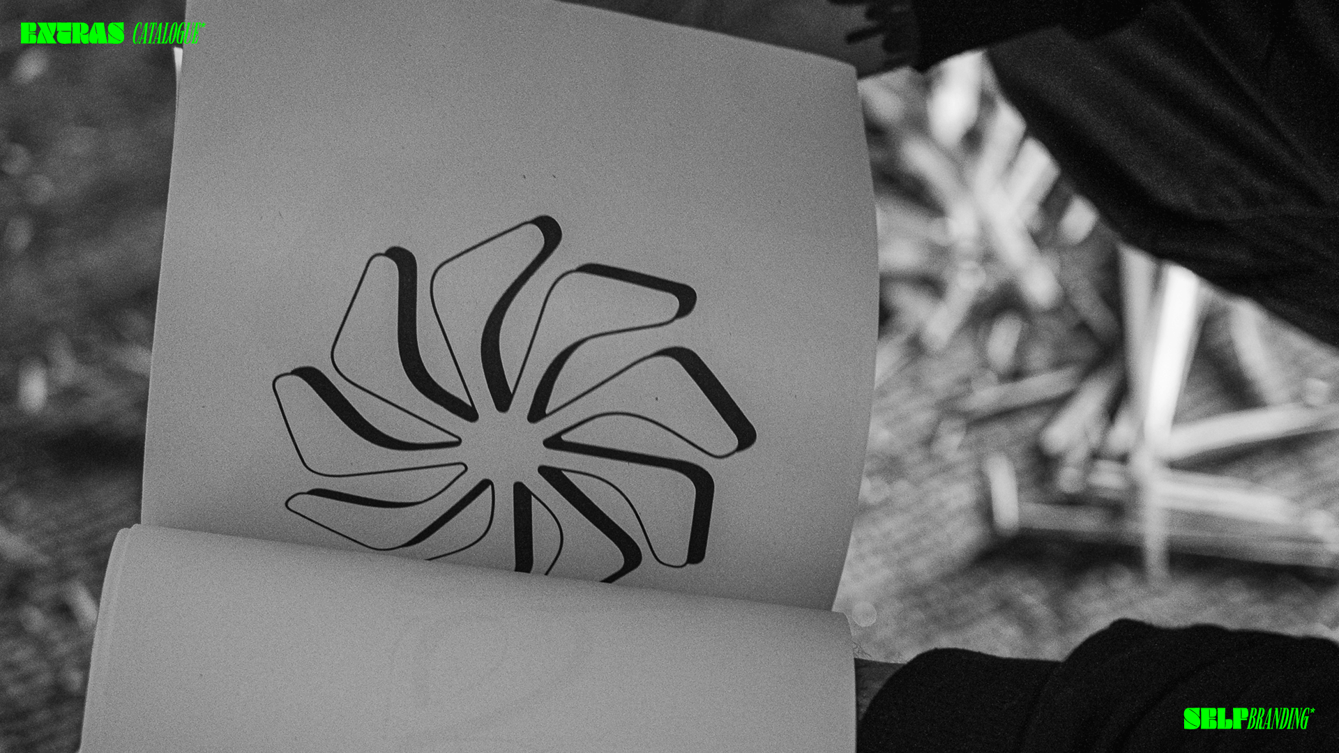
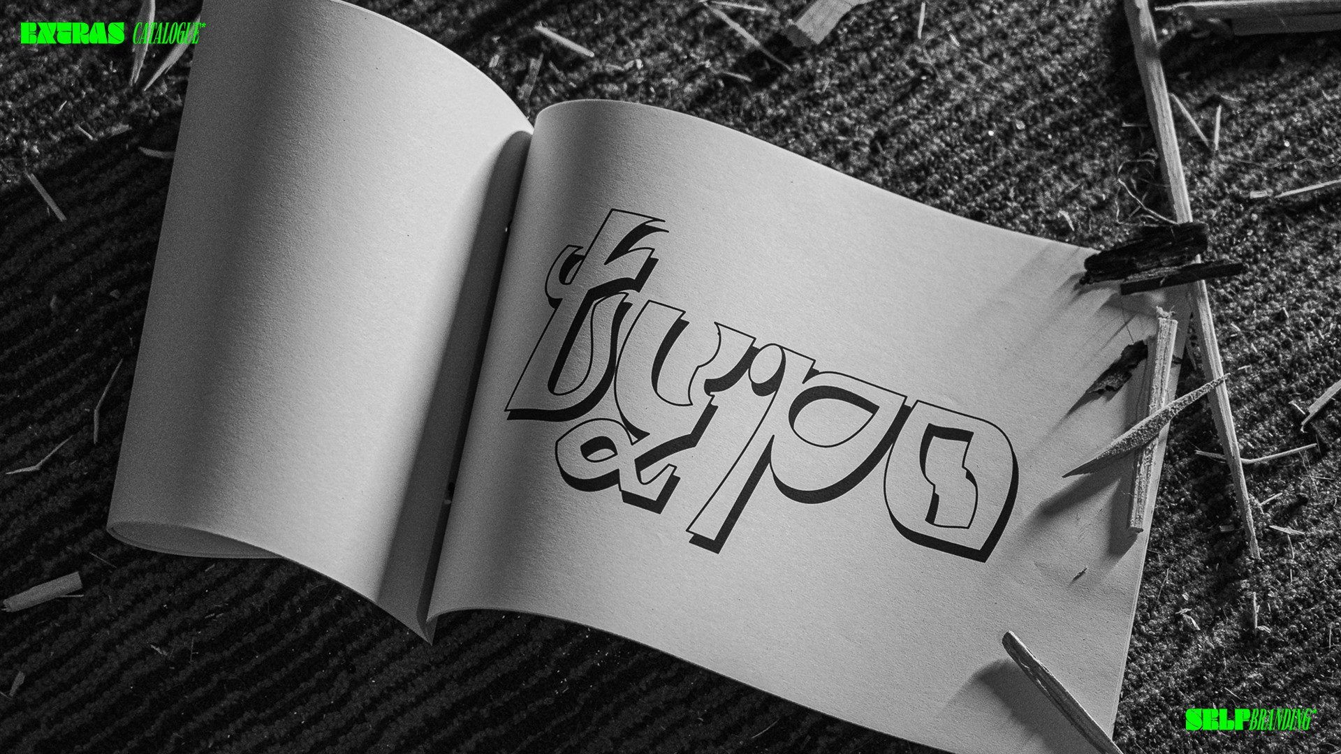
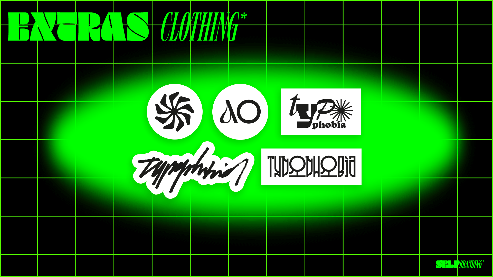
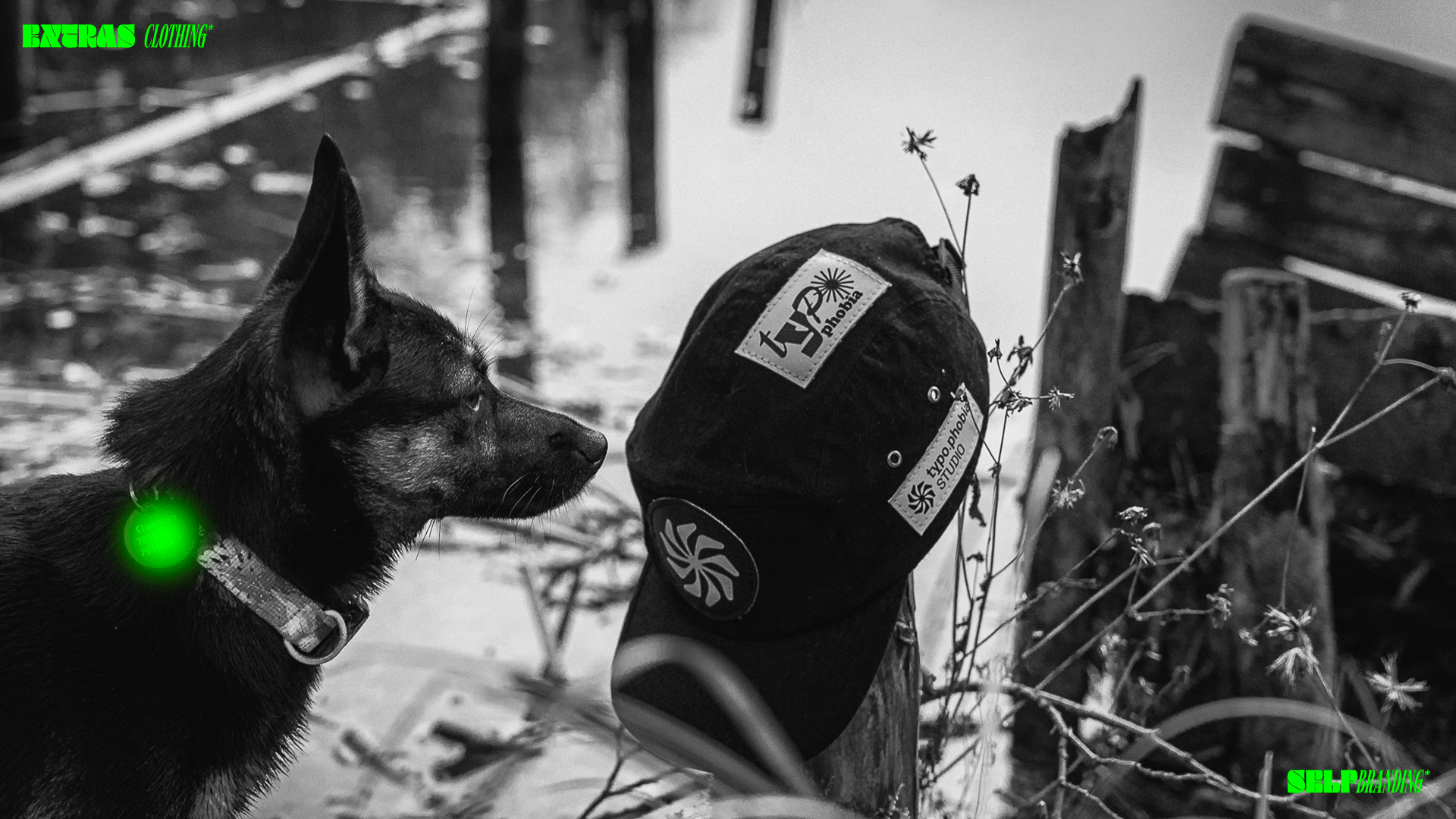
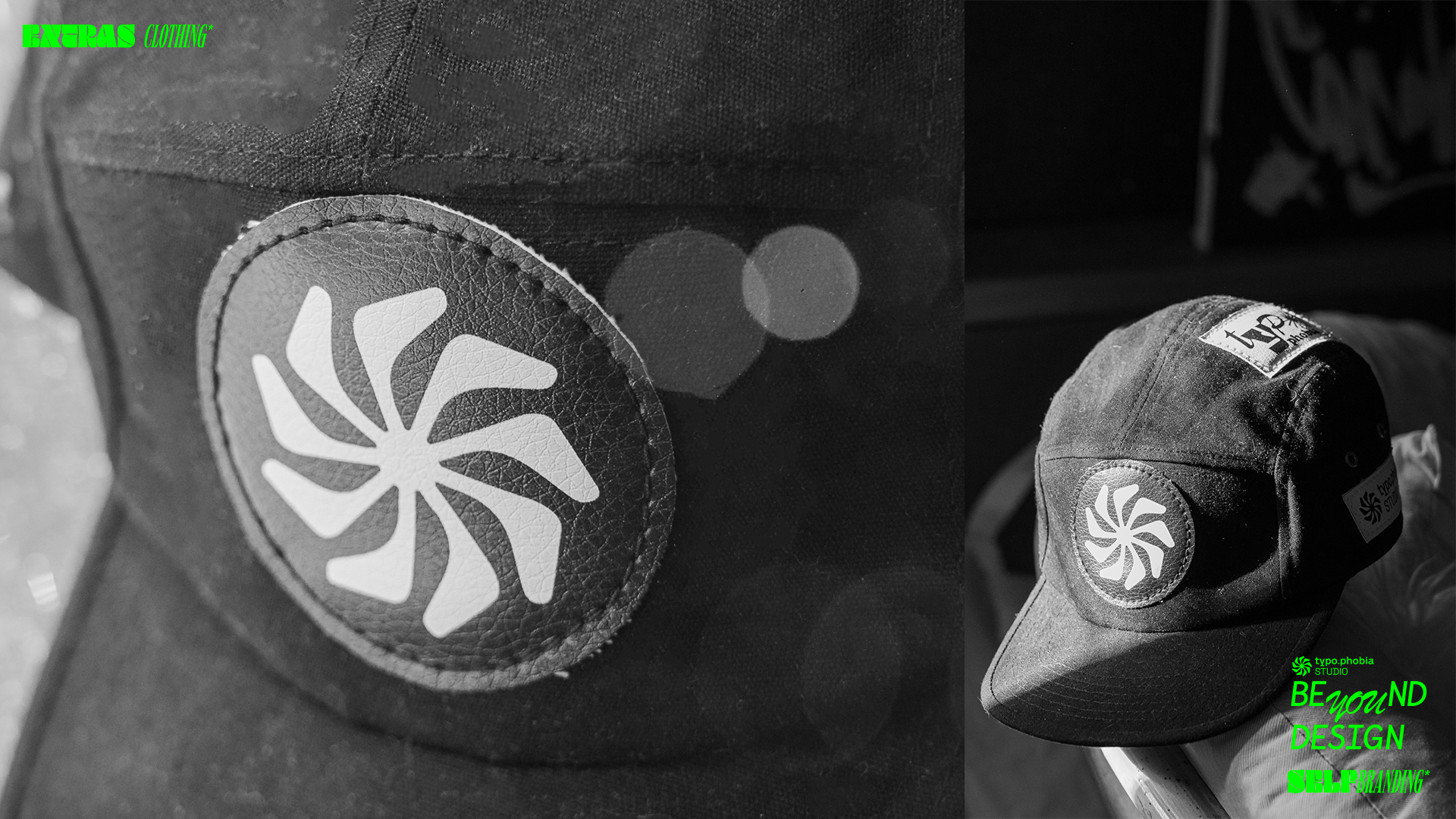
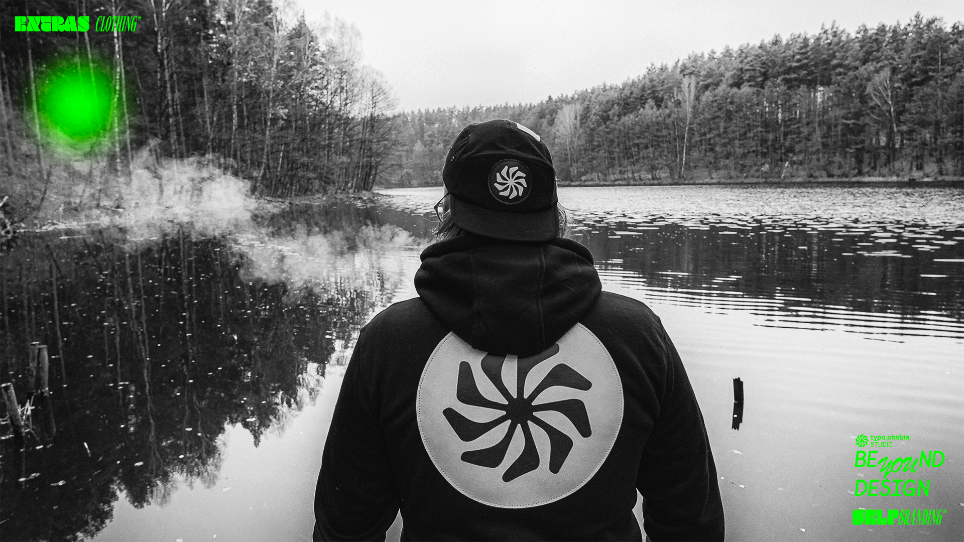
The studio's graphic symbol, along with the lettering, was created from a combination of three different typographic elements of different typefaces.
Asterisk (GALLE), the word "typophobia" (Cy bold), "studio" (SPACE GROTESK regular).
In the design assumption, the whole was to show a combination of three stylistically significantly different elements that finally fit together.
Asterisk (GALLE), the word "typophobia" (Cy bold), "studio" (SPACE GROTESK regular).
In the design assumption, the whole was to show a combination of three stylistically significantly different elements that finally fit together.
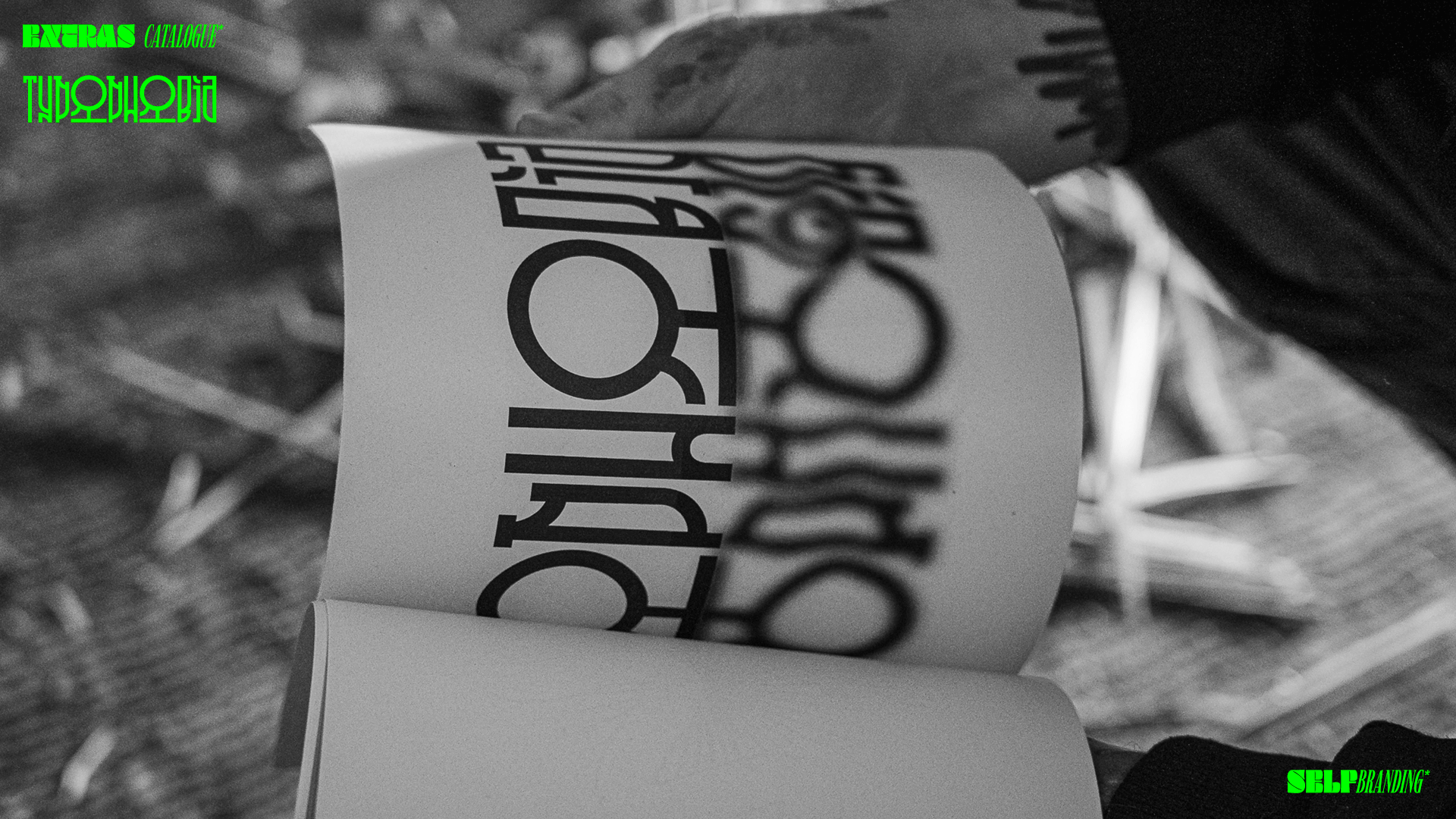
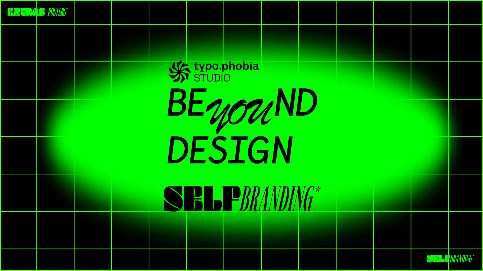
The idea behind TYPOPHOBIA is to combine various typographic styles in a rather non-obvious, "drastic" and not understood by everyone way.
In designing, we want to go back to the "old", "hackneyed" typefaces, and combine them with new, extraordinary - obtaining the effect of a pastiche in our style.
In designing, we want to go back to the "old", "hackneyed" typefaces, and combine them with new, extraordinary - obtaining the effect of a pastiche in our style.
TYPOPHOBIA is clear and simple design with "old school" elements referring to advertisements in the times when digital did not exist yet. It is drawing on street culture and graffiti art, putting it into one condensed form that corresponds and functions with the current trends of contemporary design, and can both easily break them.
TYPOPHOBIA is fear and an incurable, simply unhealthy attraction to letters, their drawing and design associated with them on every level.
We invite you to watch!